Background
Tenda Garden Supply Co is a Garden Supply start up based in Oklahoma City, OK. I was tasked with creating a icon, and logotype for the brand as well as a business card for the company’s owner and operator.
The goal was to create an identity that would work internationally as the core of Tenda’s business is done with Chinese customers who may not speak English.
Process
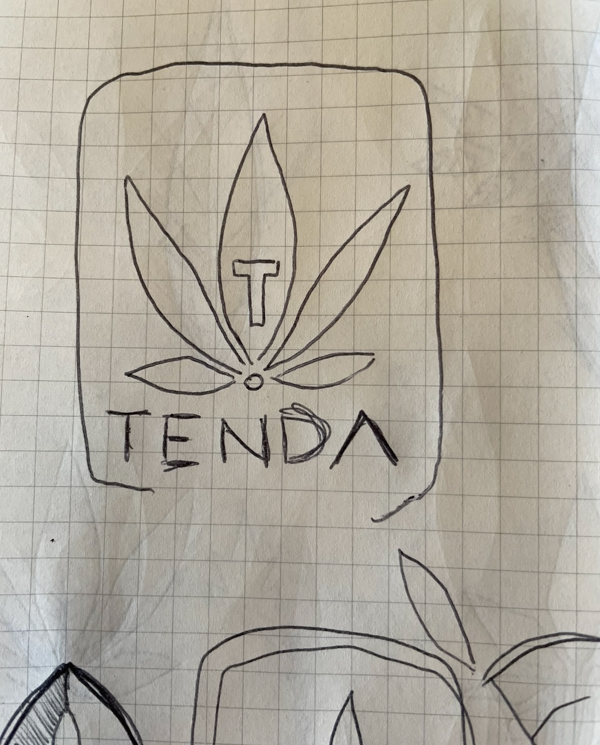
Several sketches were developed and sent over to the client, but these were the most relevant. Tenda specializes in growing tools for marijuana, and the initial sketches contained the marijuana leaf prominently. The idea to use the leaf was ultimately passed on because of a few key factors external to this project.
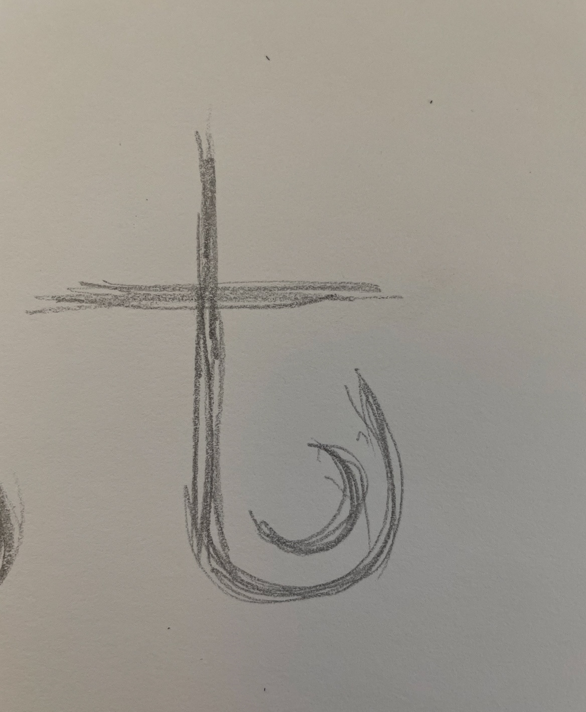

Early renders of the icon had a higher swoop on the bottom, however these ornamental elements were nixed because they took away from the visibility of the lower case "t".


Icon

The icon is a two fold image. The icon serves as a lower case "t" as well as the image of a leaf. The thinking behind this choice is that an English lower case "t" may not be recognized by foreign customers. The water sitting in the bowl of the t is holding water, a key element of growing crops.
The san serif type was chosen to give the brand a youthful, modern, edgy appearance.

Lock-up

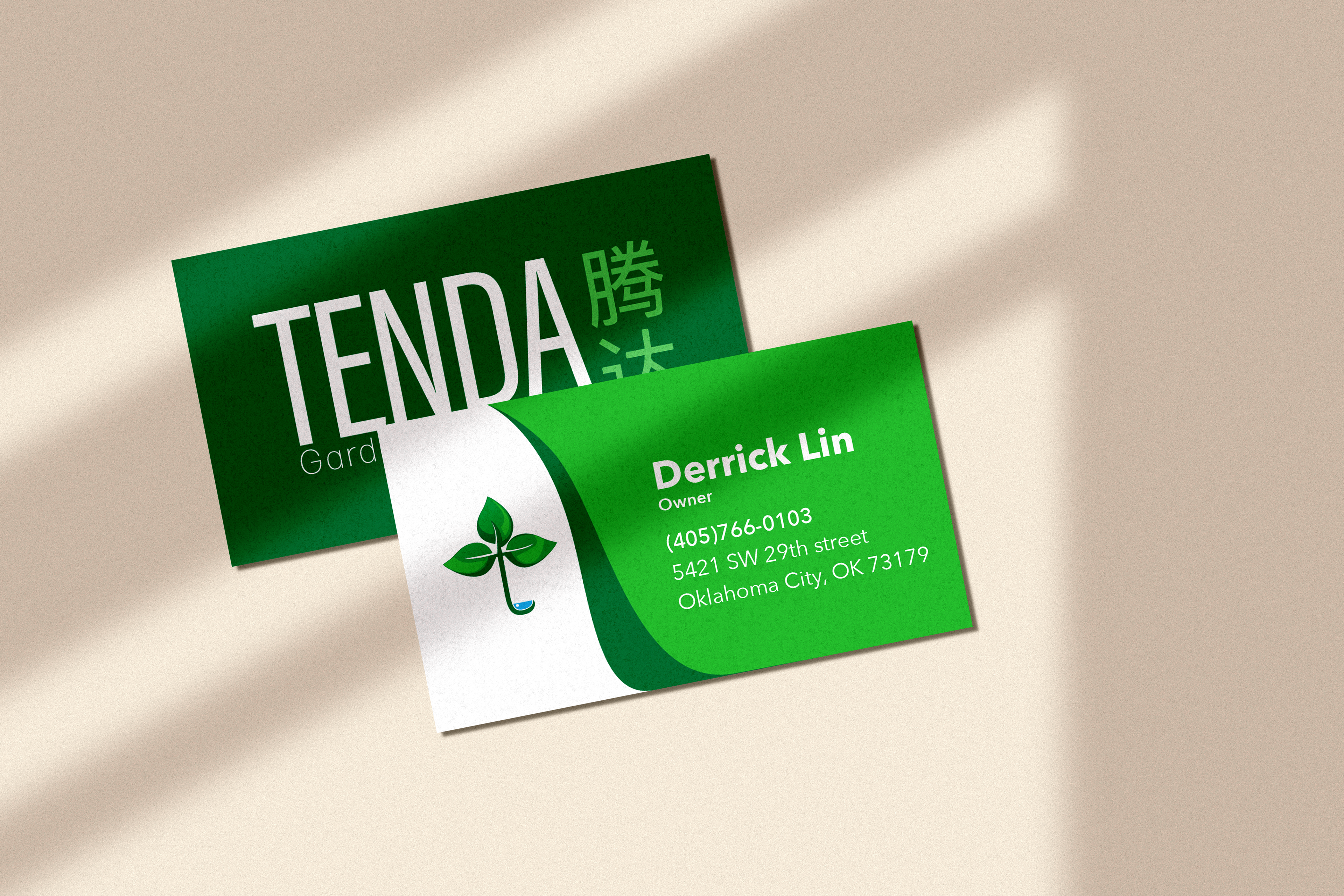
Business Card Development


sketches of the front and back of the Tenda business card.
Final Business Card